.

Friday, 15 January 2016
Evaluation Q4 - Dazhane
You can view our rough cut edit music video >HERE<
This is the our audience feedback to our rough cut edit
Alongside Class and Teacher feedback below
Good things about the music video
- Very good controlled use of camera
- Mise-en-scene , slow motion and shot types convey the story very well : the viewers can clearly see that something went wrong in the romantic relationship.
- Editing to beat was clear and effective to convey meaning.
Things To Improve By Next Week:
- Fix the lip sync of Sarene in the second chorus.
- Cut the the last part of the first scene in the music video because the camera movement is a bit jerky.
- Make the argument scene more jumpy to show that atmosphere changed. To contrast it to the happy scene
- Finish the music video !
The main points to take away from the feedback were:
1) The first establishing shot in the beginning was very effective
2) Overall, conveying the storyline was successful
IMPROVEMENTS:
- Establishing shot in the beginning was abit jerky and either needed to be taken out completely or fixed
- More jump cuts( in the arguement) and variations in movement and shot types with Sarene ( The artist).
- Fix slight out of sync with artist and music
Question 1
Vernallis and Goodwin
Vernallis
- Narrative in music video are not always in complete
- Music video are not balanced between narrative and performance
- Music videos do not always have a narrative resolution at the end
- Base tracks are used to give structure and meaning to a music video
- Edits are used more frequently and there lots of jump cuts and slow motion
For example:
In Adele's music video there is a lot of slow motion to let the audience to get the feel of the song. Also, its there to captivate the audience in each scene.
Goodwin
- Music videos are built around song lyrics and not the traditional narrative structures
- The singer is used as both a narrator and character
- Singer breaks the 4th wall by looking directly at the camera.
Goodwin believes that there are 3 main ways that visuals are used to promote the video and song lyrics these are:
- Illustration: Uses different functions in order to tell its audience the meaning of the lyrics from the song.
- Disjuncture: The meaning of the song lyrics is completely ignored
- Amplification: Meaning and effects are repeated consistently and drummed into our visions
In our video:
Our music video consists of amplification as there is meaning between the characters and the song lyrics, there is a range of slow motion showing the happy times between the lovers and the jump cuts in the fighting scene. The slow motion at the end when the girl walks away, leaving the ring on the table shows that she has 'conquered' being independent and free form the relationship.

Slow motion presented showing love and affection.

Jump cut showing them argue

Which video influenced us?
We were influenced by Jhene Aiko: Comfort inn ending
In this music video, it is all about being in a relationship: showing the good times her and her lover had and the bad. So we decided to follow the idea of the story line.
We were inspired by the costume change (3 times) casual to sophisticated:

Here her being dressed casual showed that she presented herself to be angry and Jhene wearing the dress to present that she has won.
Our costume change:

Here we used the same idea; casual was fighting scene and sophisticated was empowerment.
Our costume change:
Here we used the same idea; casual was fighting scene and sophisticated was empowerment.

Eunice - Question 1
In What WaysDoes Your Media Product Use, Develop or Challenge Forms and Conventions Of Real Media Products?
Question 3
Construction:

Research:

I present my work on emaze so that i can post it on my blog.

Here, i use the embed code; i copied it

I pasted the embed code on the HTML

I clicked on 'compose' and the finished emaze is shown on the blog.
Planning:

Here, i'm using time toast, to organise a plan on what day and time we are filming and editing.

I'm adding a 'new event' and filling in the day and title on what production task we're doing.

Once it's completed and you click on 'public', you can now see all the information.
Evaluation:
Using camtasia
 When you click on camtasia, you would see this and this allows you to record what you're seeing.
 I went on to vimeo to record my music video so that i can analyse it
 When finished, camtasia takes me to the timeline so that i can do some editing.

Here is the tools bar as i can include annotations, symbols and sound, this would make the video more entertaining and meaningful

I chose to use the annotations to show the examiner what i am talking about in further detail.
Research:

I present my work on emaze so that i can post it on my blog.

Here, i use the embed code; i copied it

I pasted the embed code on the HTML

I clicked on 'compose' and the finished emaze is shown on the blog.
Planning:

Here, i'm using time toast, to organise a plan on what day and time we are filming and editing.

I'm adding a 'new event' and filling in the day and title on what production task we're doing.

Once it's completed and you click on 'public', you can now see all the information.
Evaluation:
Using camtasia

 I went on to vimeo to record my music video so that i can analyse it

Here is the tools bar as i can include annotations, symbols and sound, this would make the video more entertaining and meaningful

I chose to use the annotations to show the examiner what i am talking about in further detail.
Eunice - Question 2
How Successful is The Combination of Your Main Product (video) and Ancillary Texts (digipak/website) ?
Question 4
Rough cut feedback:
In our rough cut, we learnt that the lip sync of the performer was not in time with the music, and we knew that if we did not act on this, we will lose marks.
Before:
This shows the problem we had with the lip sync. The lip sync was behind.
After:
We learned that we needed to use the marker again properly to when the singer instantly starts singing. This made a huge difference with the lip syncing as it looked more realistic.
The successes we had: was the location

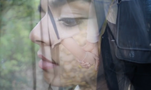
We learned from the class that the location choice in our music video was very effective as each of them created a specific scene. The brighter open space: represented happiness, the dark forest: represented the fighting scene and the sky garden: represented empowerment and independence.
We learned that the audience easily understands the relationship between the two lovers (showing the good times and the bad); this all came under the process of using different lighting, having meaningful costume changes and allowing the actress to show her emotions and feelings by using her facial expressions and hand gestures. However, i think that we included more happy, flashback scenes than the argument scene which i wished we included more of- that way the video would be more engaging to the audience.
Feedback on ancillary:
I've learnt that in my digipak and website, my audience can clearly see a synergy between the two as i have used the image of the artist and managing to use the same colour scheme so that my audience would familiarise the artist.
Question 1
Goodwin theory states there 3 main types of music videos:
1.Amplification, where the video adds new meaning to the lyrics.
2. Illustration, where the video illustrates the direct meaning of the video.
3 Disjuncture, where the video has nothing to do with the lyrics.
I feel our video follows the amplification rule as although it follows the lyrics themes of overcoming hardship, it shows this in a new light through a relationship scenario which may not be identified through reading the lyrics alone. Therefore it adds new meaning to the lyrics without deterring from the original thereof the song.
Final Ancillary: Website homepage
Please click the link below to visit my final band website homepage:
http://sarenemensah.wix.com/celinasworld
http://sarenemensah.wix.com/celinasworld
Thursday, 14 January 2016


Wednesday, 13 January 2016
Digipak Inside cover
Front cover

Inside cover

I have now completed both the inside and front cover for my digipak.
As you can see I have carried out my black and white them throughout the digipak and website to create links and synergy.


Celina Website
I have now completed the website for my artist.
Click here to visit the brand new website.
Click here to visit the brand new website.
Tuesday, 12 January 2016
Final Digipack - Ancillary Product (in production)
This are only screenshots of my digipack :


Front/Back cover

Inside cover
My Reflection :
- Well, i think the process is going well. I'm satisfied and confident with the front cover because it matches with the genre i'm focusing in.
- At the beginning i had some issues with the pictures i used (in the front cover) because i wasn't following the rule : there shouldn't be any empty space over the artist's head. Therefore i placed the name of the artist over her head and made it bigger to fill up the space. While on the back of the front cover i made the image bigger without damaging the quality of it.
- Although i feel very indecisive when it comes to the inside cover, specially on the left had side where i have two profile's silhouette of Sarene facing each other : i feel that in some way it looks two much, but at the other hand i feel that it looks quite empty if i take them out.
Improvements:
- Inside cover : the cd has a hole but in my inside cover it's not very clear because we can still see Sarene's hair : i have to make the little hole , the same colour as the background.
- Inside cover: decide whether i'll use the silhouette of Sarene or not. I'll ask some of my target audience, opinions to help me.
- Add copyright information on the cd and the companies logos.
OFFICIAL WEBSITE FOR CELINA
WELCOME BACK
The official website for our artist Celina is now complete and up and running here:
Digipak front cover

I also applied a barcode and various copyright labels to fit the conventions of a digipak.
I chose black and white as it imitated my inspiration digipaks. I chose this font as I feel it is feminine yet bold and fits well with the image of the artist. I have chosen these images of the artist to represent the artist and the brand and make sure the sole focus is the artist.
Editing using photoshop


Production of ancillary products 2
I have also began producing my website for my artists. I have looked at various websites of similar artists and used conventions from these which I like in my own website.
For example I liked the set up of Justin Bieber's website and how bold titles are used to introduce each section, I have imitated this on my own website.
I also liked the simplicity of the white background and the photo album layout which I have also replicated in my website.


For example I liked the set up of Justin Bieber's website and how bold titles are used to introduce each section, I have imitated this on my own website.
I also liked the simplicity of the white background and the photo album layout which I have also replicated in my website.


Making of ancillary products 1
I have worked on the production of my digipak cover. This included editing some shots we took using photoshop and adding text and typical conventions of a digipak.
Some of these conventions include a barcode, the production logo and the website.
Using photoshop I used different filters and cropped various photos so to fit on to my digipak.

Some of these conventions include a barcode, the production logo and the website.
Using photoshop I used different filters and cropped various photos so to fit on to my digipak.

Monday, 11 January 2016
Using photoshop and lightroom for my ancillary work

VS
For my ancillary work I decided to use both Lightroom and Photoshop to edit and create the final product. Since I was using Apple Macs to edit, and I am already familiar with both softwares - I thought i would use this to my advantage.

LIGHTROOM
I mainly used Lightroom for the photography side of the ancillary work. In my opinion, it was easier and quicker for me to navigate and get my ideas across with lightroom because I already have alot of experience with it for photography. One of the main tools I used with this software was editing and controlling the saturation and luminance of certain colours in the photo. This gave my photos that colour splash/pop affect as I turned down the most prominent colours and left reds and oranges which were the pigments in the artists face.


BEFORE
AFTER
Photoshop
I used photoshop mainly in the making of the ancillary product to add the images to a digipack template and add text as well as any other effects. These are the things I could not do in lightroom and therefore photoshop helped me to complete this. Photoshop has given me the option to edit my ancillary product to a more advanced level. Working in layers made it easier to create the desired look for my digipack and allowed me to delete/add certain things without disrupting my product.

I used photoshop mainly in the making of the ancillary product to add the images to a digipack template and add text as well as any other effects. These are the things I could not do in lightroom and therefore photoshop helped me to complete this. Photoshop has given me the option to edit my ancillary product to a more advanced level. Working in layers made it easier to create the desired look for my digipack and allowed me to delete/add certain things without disrupting my product.
Draft Front cover VS Final front cover Thoughts
FINAL FRONT COVER

Since doing my draft ancillary front cover, I believe I have progressed extremely well in terms of my theme and conventions of a digipack. Although my idea is pretty much the same you can clearly see how I've been able to take an idea to another step and show that I understand the conventions of a digipack.
With my draft front cover there was many things that didnt work. Firstly, I started to realise that having two photos on the front of the digipack was not ideal and instead I took a more simplisitic approach for my final product. I thought that having two photo distracted the viewer and It looked like too much was going on. I always wanted to show the darkness and lightness on the front cover and I solved the problem of having two photos by then having it fade into plain white.
The crown icon was then added as a symbol of 'conqueroring'. This again was something so simple but affective and stopped the back cover from being plain and boring.
I mirrored the conventional production and copyright information at the back of the front cover and I think this brought my digipack to life and made it more realistic.
]
DRAFT FRONT COVER

Subscribe to:
Posts (Atom)