eval 1.11 from Dazhane fleming on Vimeo.
.

Showing posts with label Dazhane Fleming. Show all posts
Showing posts with label Dazhane Fleming. Show all posts
Friday, 15 January 2016



Evaluation Q4 - Dazhane
You can view our rough cut edit music video >HERE<
This is the our audience feedback to our rough cut edit
Alongside Class and Teacher feedback below
Good things about the music video
- Very good controlled use of camera
- Mise-en-scene , slow motion and shot types convey the story very well : the viewers can clearly see that something went wrong in the romantic relationship.
- Editing to beat was clear and effective to convey meaning.
Things To Improve By Next Week:
- Fix the lip sync of Sarene in the second chorus.
- Cut the the last part of the first scene in the music video because the camera movement is a bit jerky.
- Make the argument scene more jumpy to show that atmosphere changed. To contrast it to the happy scene
- Finish the music video !
The main points to take away from the feedback were:
1) The first establishing shot in the beginning was very effective
2) Overall, conveying the storyline was successful
IMPROVEMENTS:
- Establishing shot in the beginning was abit jerky and either needed to be taken out completely or fixed
- More jump cuts( in the arguement) and variations in movement and shot types with Sarene ( The artist).
- Fix slight out of sync with artist and music
1) The first establishing shot in the beginning was very effective
2) Overall, conveying the storyline was successful
IMPROVEMENTS:
- Establishing shot in the beginning was abit jerky and either needed to be taken out completely or fixed
- More jump cuts( in the arguement) and variations in movement and shot types with Sarene ( The artist).
- Fix slight out of sync with artist and music
Thursday, 14 January 2016
Wednesday, 13 January 2016
Tuesday, 12 January 2016
OFFICIAL WEBSITE FOR CELINA
WELCOME BACK
The official website for our artist Celina is now complete and up and running here:
Monday, 11 January 2016
Using photoshop and lightroom for my ancillary work


VS
For my ancillary work I decided to use both Lightroom and Photoshop to edit and create the final product. Since I was using Apple Macs to edit, and I am already familiar with both softwares - I thought i would use this to my advantage.

LIGHTROOM
I mainly used Lightroom for the photography side of the ancillary work. In my opinion, it was easier and quicker for me to navigate and get my ideas across with lightroom because I already have alot of experience with it for photography. One of the main tools I used with this software was editing and controlling the saturation and luminance of certain colours in the photo. This gave my photos that colour splash/pop affect as I turned down the most prominent colours and left reds and oranges which were the pigments in the artists face.


BEFORE
AFTER
Photoshop
I used photoshop mainly in the making of the ancillary product to add the images to a digipack template and add text as well as any other effects. These are the things I could not do in lightroom and therefore photoshop helped me to complete this. Photoshop has given me the option to edit my ancillary product to a more advanced level. Working in layers made it easier to create the desired look for my digipack and allowed me to delete/add certain things without disrupting my product.

I used photoshop mainly in the making of the ancillary product to add the images to a digipack template and add text as well as any other effects. These are the things I could not do in lightroom and therefore photoshop helped me to complete this. Photoshop has given me the option to edit my ancillary product to a more advanced level. Working in layers made it easier to create the desired look for my digipack and allowed me to delete/add certain things without disrupting my product.
Draft Front cover VS Final front cover Thoughts
FINAL FRONT COVER

Since doing my draft ancillary front cover, I believe I have progressed extremely well in terms of my theme and conventions of a digipack. Although my idea is pretty much the same you can clearly see how I've been able to take an idea to another step and show that I understand the conventions of a digipack.
With my draft front cover there was many things that didnt work. Firstly, I started to realise that having two photos on the front of the digipack was not ideal and instead I took a more simplisitic approach for my final product. I thought that having two photo distracted the viewer and It looked like too much was going on. I always wanted to show the darkness and lightness on the front cover and I solved the problem of having two photos by then having it fade into plain white.
The crown icon was then added as a symbol of 'conqueroring'. This again was something so simple but affective and stopped the back cover from being plain and boring.
I mirrored the conventional production and copyright information at the back of the front cover and I think this brought my digipack to life and made it more realistic.
]
DRAFT FRONT COVER

Friday, 8 January 2016


Wednesday, 6 January 2016
Working on ancillary work 6/1/16

Today was the start of my ancillary digipak on photoshop. I used the photo I originally said I was going to use in my previous blogs and imported it into photoshop. Originally, I wanted to use the photo above as well as another photo of the artist on the bridge however I came across many difficulties doing so as the two photos had completely different colour schemes and they did not go together.

Another problem I faced was finding a way of adding a gradient effect from the photo onto a solid colour. After much playing around in photoshop I was able to merge the photo and solid colour together to create the front and back cover of the digipack

After that, I started to play around with the text placement - I started to have trouble with using white as a font colour as the original photo as a gradient of black and white and the text was not noticeable. Again with trial and error I was able to overcome this problem.
Saturday, 2 January 2016
Detailed analysis of 2 digipaks ( ONE )
Janelle Monae

It was a pretty random palette: Afrofuturism, Androids, uniformity, Mod sorority, a little Prince, a little Donna Summer, a little MJ, a bit of Egypt, a hint of punk, and some cheesy 80s sci-fi. But it wasn't until several weeks in-- upon hearing some of the new tracks, actually-- that I was able to bring all of these disparate ideas together.
Friday, 18 December 2015
Ideas and inspiration for digipak
Below is my intial ideas and inspiration behind the making of my digipak
Monday, 14 December 2015
Potential photos for ancillary work
Here are some examples of the photos I hope to use for my digipack

In this photo, I used lightroom to manipulate the saturation of certain colours within the photo. By doing this, It starts to create a colour splash effect, having most of the background desaturated with the foreground in focus.

( -100 means i have desaturated those selected colours)

BEFORE
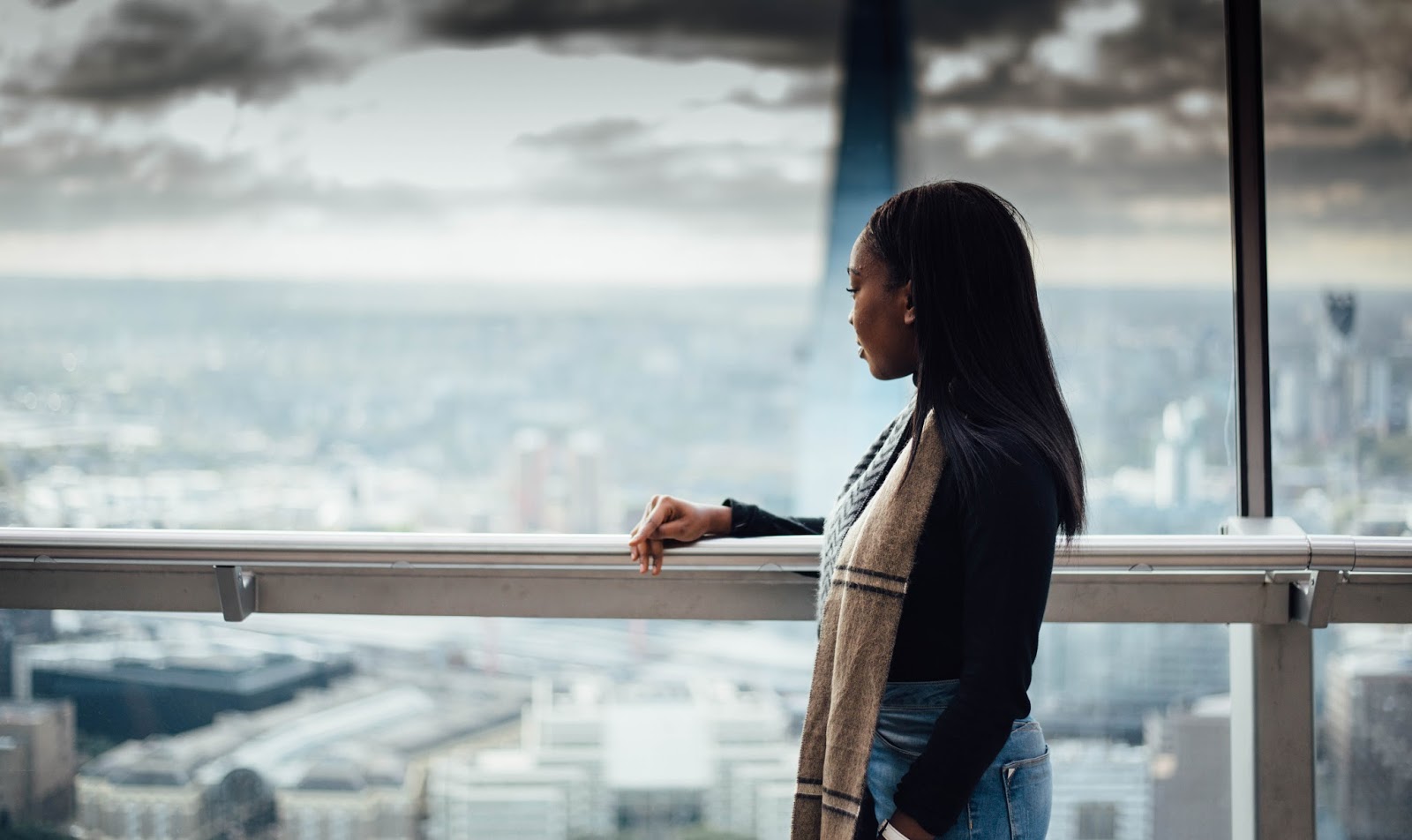
AFTER
Wednesday, 9 December 2015
Music vid draft ( FCPX Edit) by Dazhane
I decided to take some of the clips we filmed and edit it ontop of the soundtrack as a draft of what the music video might look like. This is only a base, so that when we do come onto editing on premiere pro, we have sort of structure to follow by:
link.


Subscribe to:
Posts (Atom)